BBC News
Making Sense of How We See Time
Interactive Infographic - A Brief History of Time Zones
Commision to show the exploration into the fascinating, often bizarre & complex history of how we see the time zones across the Earth.
This took the form of a standalone interactive infographic piece that appeared on the BBC Homepage and on it's own dedicated page within BBC News website (As well as publicised widely on the BBC TV Broadcast Channels at the time).
I designed and created the entire piece: Interface, interaction, behaviour, visual design & assets, including working out how to show all the timzones in a logical and clear manner from a single flat basic graphic map - nothing of the like existed or was available at the time (surprisingly to me), so was a case of creating a pattern that showed the division across the globe based on my own research. Drawing each of the 25 indivdual flat illustrations that make up the rotating globe.
The classic BBC clock was also cheekily revived for this momentous occasion.


BBC World Service News
US Elections 2012
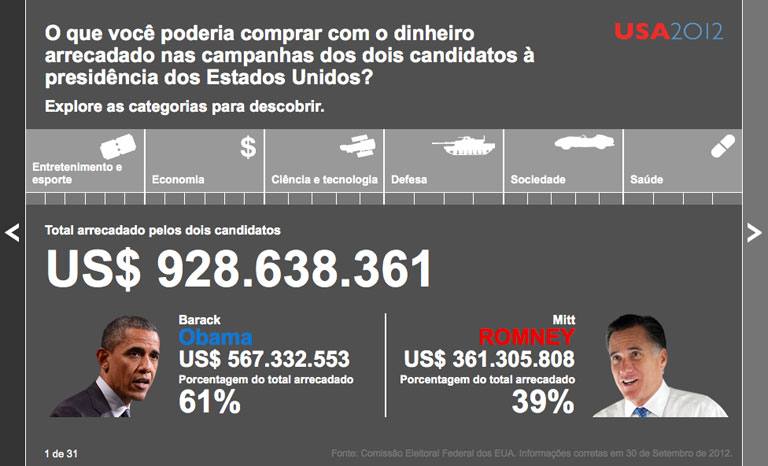
Standalone interactive piece that appeared on the BBC News website and across the BBC World Service, translated in to 27 languaes and scripts.
Part of the task was to make sure it would work in every language, including right-to-left layouts for Arabic scripts.
Essentially showing the Spend comparison interactive of the US Elcetions that year - What the $2 billion US Dollars raised during the campaign could have also paid for.


BBC News & World Service
Various Infographics
A few examples of the many Infographics & Charts I created or translated into many languages and scripts for BBC News and BBC World Service.


